
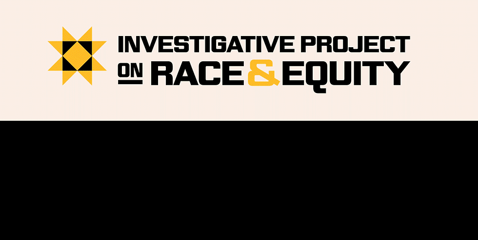
Investigative Project on Race and Equity
A Nonprofit Investigative Newsroom
The Challenge
Born like a phoenix from the ashes, The Investigative Project on Race and Equity was founded by several former journalists from The Chicago Reporter after the newsroom shut its doors. These seasoned investigative journalists were determined to keep their 50-year legacy alive while also opening doors for the next generation of journalists.
When we partnered for a complete brand identity overhaul, it was crucial for the new identity to reflect the deep legacy of work that they had championed, while also feeling fresh and inviting enough to welcome in a greater community of people who are looking for trustworthy journalism that exposes injustice, informs action and ensures communities affected by systemic racism are seen, heard, and empowered.
The Client
The Investigative Project on Race and Equity
Industry
Journalism
Services
Art Direction | Visual Identity | Positioning
Credits
Art Direction & Strategy: Mere Montgomery
Project Management: Julie Nygaard
Web Development: Laura Thompson
Created in Collaboration with Oxbow Collective
The Challenge
Add paragraph text. Click “Edit Text” to update the font, size and more. To change and reuse text themes, go to Site Styles.
The Approach
Through close collaboration and in-depth research, we shaped a brand identity rooted in clarity, credibility, and care. The design system is built to flex, because the stories are alive—translating complex, data-driven reporting on race and equity into visuals that feel accessible without losing rigor. What emerged is a dynamic identity inspired by the history of community-oriented journalism and designed to hold nuance, invite curiosity, and make space for collective understanding in a landscape that too often flattens it.
The Investigative Project on Race and Equity is a trusted and essential force in Chicago journalism. They partner with other trusted news outlets, and train the next generation of journalists.
The Inspiration
The identity intentionally connects IPRE’s work to a powerful historical lineage, connecting different points in time through a shared goal of liberation. The 1966 Freedom Festival and the Chicago Freedom Movement, The Black Panther’s Intercommunal News Service, and the quilted ‘North Star’, a symbol of safe passage and hope in the pursuit of truth, all inspired the newsroom’s new visual language.


The Colorway
The new colorway is drawn from the Black Panther Party’s Intercommunal News Service. This weekly periodical was in print for 13 years, beginning in 1960. In its heyday, it would sell over a hundred thousand copies a week, and it was a crucial outlet for the organization to report on community programs, share fact-based stories of racial and economic oppression, and cover global resistance movements. Many copies were printed in black and white and featured one pop of color at a time. The colors give a sense of light, hope, and joy.
The Type
The typography is inspired by the 1966 Freedom Festival and the Chicago Freedom Movement, where the Rev. Dr. Martin Luther King Jr. and the Southern Christian Leadership Conference mobilized communities to challenge segregation in education, housing, and employment. The type was designed and created by Tres Seales, who was inspired by the bold signage displayed at the Freedom Festival.

The Investigative Project on Race and Equity is the only Chicago newsroom actively challenging traditional reporting by equipping journalists and partnering with newsrooms to expose and dismantle systemic racism through reporting stories on real people and their communities, backed by complex data.
The Feeling
It was important that all types of people from an Americans city were able to see themselves represented and defended by the work, words, and visual identity of the newsroom, both in the present and from a historical lense.


The Identity was designed to help transform complex data into clear, trustworthy stories that invite deeper engagement with race and equity.

Impact & Outcome
The new identity gave IPRE a visual system strong enough to carry fifty years of journalistic legacy, while leaving room to grow. It clarified their role as a trusted investigative newsroom and made their work more approachable for readers encountering in-depth reporting on race and equity for the first time.
Across platforms, the brand helps translate dense, data-driven investigations into stories that feel readable and grounded without losing rigor. Journalists gained tools for clarity and consistency, while partners and funders gained a brand that clearly signals credibility and purpose. Most importantly, the identity helps IPRE show up as what it already is: a community-rooted newsroom committed to justice and telling hard truths with care and intention.
