Trout Unlimited
Priority Waters
The Challenge
Priority Waters is a big idea: part strategic blueprint, part educational tool, part interactive map meant to get people outside and involved. Trout Unlimited needed a digital experience that could hold all of that at once. It had to speak to scientists and longtime anglers without losing people who were just beginning to care about coldwater fisheries. And it needed to feel unmistakably connected to the Trout Unlimited brand, without feeling like a brochure, or worse, a data dump.
The Client
Trout Unlimited
Industry
Conservation
Services
Branding for the Sub Brand | Web Design | Interactive Map Design
Services
Creative Direction & Design Strategy, Web Design: Demetrio Maguigad
Art Direction & Web Design: Mere Montgomery
Project Management: Julie Nygaard
Development: SNail

The Approach
I led the art direction and collaborated closely on the web design to expand the existing brand into something more experiential. The site was designed to guide users through exploration rather than explanation, using visual cues to help them decide where to go next, both digitally and IRL. Throughout the process, accuracy mattered just as much as aesthetics. The work had to respect the depth of knowledge held by researchers and conservationists while still feeling accessible to anyone curious enough to click around. The goal was to not only get users curious about the work but to get them planning their next outdoor adventure through the lens of a conservationist.

Building something that prioritizes exploration rather than explanation
The Approach
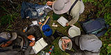
The visual direction was shaped by the lives and journeys of salmon and trout, the species at the heart of Trout Unlimited’s work. The site invites visitors to move through the experience from the perspective of these fish, following their paths through rivers, watersheds, and obstacles that define their survival. We drew from Trout Unlimited’s extensive photography archive and collaborated with an illustrator to hand-paint species native to each priority waterway. Every visual element is tied to a real place and ecosystem, grounding the experience in lived landscapes rather than abstract conservation concepts.


The Feeling
The site is meant to feel alive and inviting, not instructional or preachy. It makes room for curiosity, letting people wander, follow rivers, and learn at their own pace, while still grounding everything in real science and real work. The experience nudges visitors toward that familiar thought: I want to go there. And then, ideally, the next one: I should probably understand what’s at stake when I do. It’s about turning interest into intention, and intention into action, without making it feel like homework.

actively protecting, conserving, and restoring America's coldwater fisheries and their watersheds.


Impact & Outcome
The finished site gives people a way in, whether they’re there to learn, to plan, or to get involved. Priority Waters now works as both a resource and an invitation, connecting users to specific waterways and showing them how conservation actually happens. It turns curiosity into participation, and turns a map into something that feels alive. See for yourself and get outside!
